
Summary:
Minor visual changes help users distinguish between 5 different button states: enabled, disabled, hovered, focused, pressed.
Buttons are core user-interface elements that, when clicked or tapped, execute an action. When designed correctly, buttons set accurate user expectations and help them understand how to interact with the interface. In addition to clear button labels, effective signaling of button states is critical for a good design.
Button States Explained
You’ve probably experienced that annoying situation when you try to click on a button, but nothing happens. How do you know when you can click on a button versus when you can’t? Designers usually communicate that type of information through subtle visual cues that indicate to users the state of the button: whether it’s clickable or not, whether it has been pressed, whether it has been hovered on.
The most commonly used button states are:
- Enabled
- Disabled
- Hover
- Focus
- Pressed
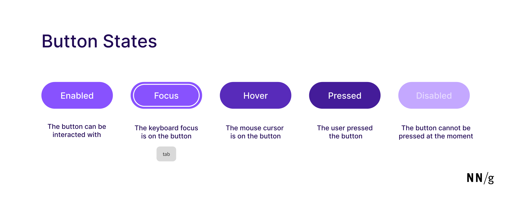
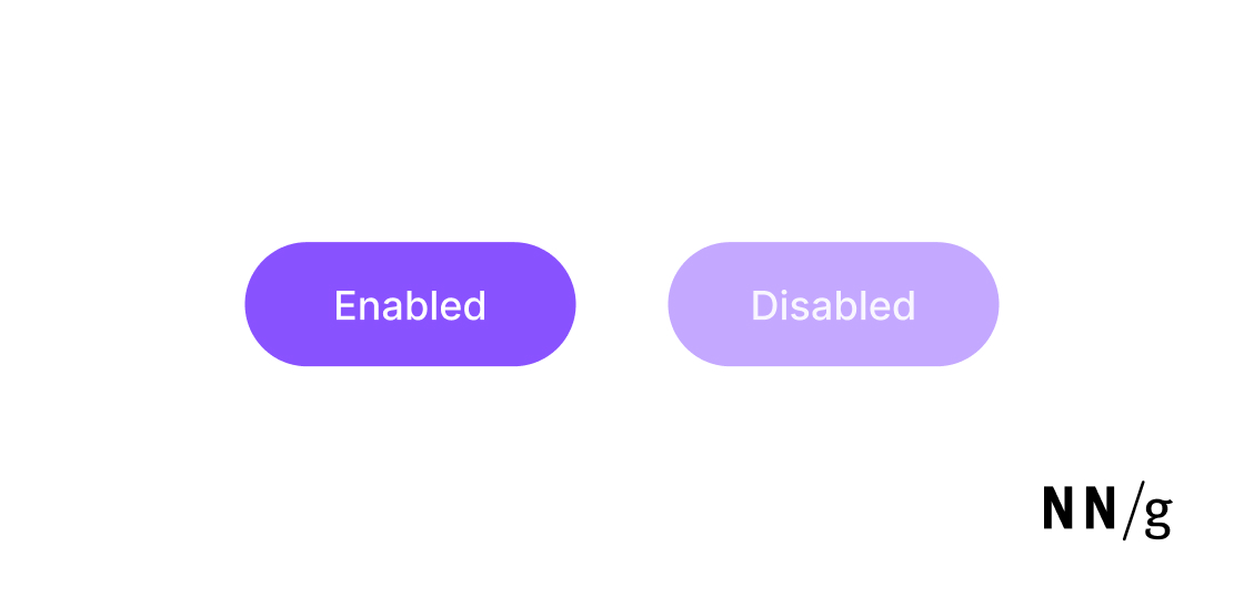
Enabled State
The enabled state, also sometimes called the default state, indicates that the button can be pressed or otherwise interacted with. When a button is in this state, it’s available to be clicked or tapped, and will perform its intended action.
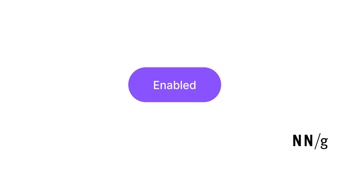
When a button is available and active, we usually want it to catch users’ attention — especially if it’s a primary or call-to-action button.
Typical styles for enabled buttons have the following visual characteristics:
- High contrast between the button and the rest of the design
- Legible label
- An optional skeuomorphic shadow to add a 3D feeling
Disabled State
Opposite of the enabled state is the disabled state. This state indicates that the button’s action is unavailable — the button can’t currently be clicked or tapped. In the disabled state, the button’s appearance doesn’t change when users try to interact with it.
For example, if a user has not filled in all required fields in a form, the form’s Submit button may not be active.
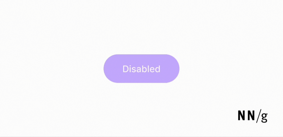
Typical styles for disabled buttons have the following visual characteristics:
- A light gray or otherwise desaturated color or a more muted version of its abled state to signal it isn’t clickable or tappable
- Lower contrast between the label and the background (but mind readability)
Labels for disabled states don’t need to be as high-contrast as those for enabled states, but you still want people to be able to read them. On the other hand, you don’t want the contrast to be as high as to trick people into thinking the button is clickable. If you are designing button states, it’s a good idea to test them with real users to make sure they are usable and visually distinct.
Disabled button states should also have the ARIA-disabled: true attribute added to the code. This attribute will allow the button to still receive tab focus but will indicate to screen readers that the button is inactive, thus announcing to users its disabled state.
Hover State
The hover state is triggered when a user moves their mouse cursor over a button or other design element and is meant to indicate that the button is clickable. (This state will obviously not be visible to users who do not use a mouse — for example, mobile users.) To prevent the color change from happening when users don’t mean to hover over a button (for example, because they are moving their mouse across the screen) a slight delay (around 150–200ms) should be added to this state.
Typical hover states have the following visual characteristics:
- A slight darkening of the background color compared to the enabled state
- Changing the cursor from an arrow to a hand
Focus State
The focus (or keyboard-focus) state helps people know which active button has the keyboard focus. When a user uses the Tab key to move across various active elements on a page, the focus state indicates which element is currently selected (and could be activated by using the Enter key). The focus state should appear pretty quickly (around 100-150ms) after the user uses the keyboard. Otherwise, the user may end up tabbing on the keyboard again and may miss the desired button.
By default, a focus state is signaled by a blue outline around the element. However, you can easily customize how the focus element looks like, to fit your visual-design needs or brand standards.
That being said, I strongly recommend that you stick to the stroke or outline to indicate focus, as opposed to relying on color change alone, for two reasons. First, this indicator is the default signal and many users expect it. Second, color change alone may not be perceived by some people with vision impairments.
Pressed State
The pressed state indicates that the user has tapped or clicked a button. It is meant to give the user feedback that the action they performed was registered by the system and usually appears as a very slight color change or a very short and minimal animation. The pressed state should appear within 100–150ms for the user to register that the pressing action is instantaneous. If this feedback is not timely, users will press the button multiple times and potentially cause issues.
Other States: Loading and Selected
In addition to these 5 core button states — enabled, disabled, hover, focus, and pressed — there are a few more fundamental states to include in a design system.
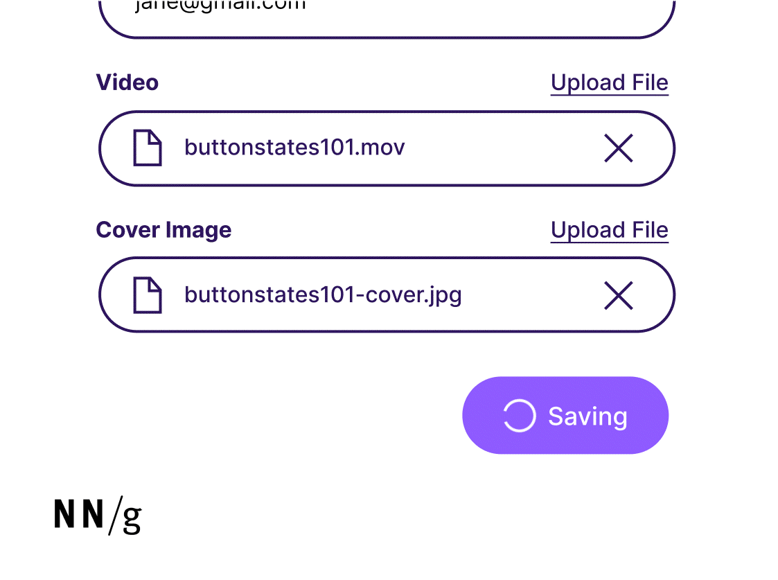
Loading State
This button state lets users know that the action corresponding to that button is being performed. It is used for actions that tend to take a longer amount of time to complete (for example, because they require some backend verification or the loading of a larger document).
The loading state typically uses the enabled state and adds a loading spinner or indicator to the left of the button label. Once loading is complete and the action is performed, oftentimes, you will see the spinner animate to a check icon to visually show that the action was successful.
Selected State
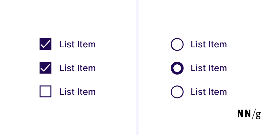
The selected state is associated with checkboxes or radio buttons, and it indicates that the user selected that option. Note that this state is not a button state, but we include it here because sometimes it is confused with the button pressed state.
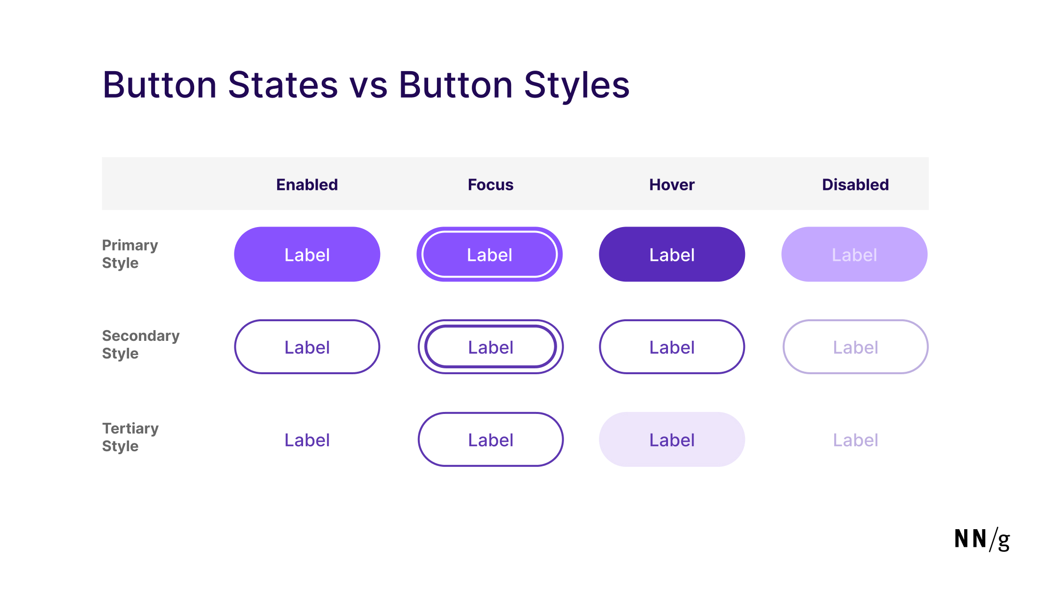
Button States vs. Button Styles
A button style refers to how the button is visually represented in the interfaces and how much visual emphasis it gets. In an interface, it’s typical to distinguish among three (or more) different button styles: primary, secondary, and tertiary, depending on the button’s importance in the UI. The same button can be in different states at different times, depending on the user’s actions or the system’s state. But one button will have only one style.
Primary
Primary buttons have the most visual emphasis to grab user attention and direct them to an important or common action such as compose, create, save, and check out. Primary buttons are typically solid, filled buttons.
Secondary
Secondary buttons have a medium visual emphasis and are meant for actions that are less important or commonly used. These are actions like cancel and reply. Secondary styles are typically outline buttons.
Tertiary
Tertiary buttons have the least amount of visual emphasis and are dedicated to optional or supplementary actions (e.g., view more).
Don’t Forget a Useful Button Label
While button states are crucial to designing good, usable buttons, another equally important aspect of a button is its label. Labels should clearly describe what the button will do, while being substantial and succinct enough to stand alone. Avoid generic labels such as Continue or Next. These small bits of UX copy massively contribute to the findability and accessibility of your site’s functionality.