
I treated my board game like a product and used UX practices to improve its UI—simplifying the game and maxing the fun.
As a User Experience (UX) professional, it’s hard to ignore the correlation between UX and board game design. From defining personas, to prototyping and usability testing, to content hierarchy… The parallels are incredible and if you’re a board game designer, you’re likely already doing them, perhaps without knowing it.
The benefits of applying UX design to board game design only starts here (during the initial design phase). But UX principles are beneficial from start to finish. For example, heuristics can be used to audit and improve final UI elements. Information Architecture principles can be used in component design and rulebook creation. And leveraging common iconography will ensure players can easily understand intent.
Here are the key takeaways that you should consider when designing your board game (and will be explored below):
- UX practices will improve your board game.
- You must clearly identify who your game is for, connect with them, and listen to them, in order to improve.
- Having an open mind is critical to the design process.
- Your main job is to steer the ship and bring your vision to life. You need to decide what’s best for your game.
Before we go any further, let’s all speak the same language. Each time you play a game-in-progress, it’s called a playtest. I have now had many playtests, gotten so much invaluable feedback, and played my game with dozens of people. I sincerely want to thank everyone who have participated in the process for their time and opinion. I would not be where I am today without them.
WARNING: This is a deep dive into the evolution of a single component of a larger board game. A card. This card has gone through roughly 10 iterations, but I’ll focus on 3 critical checkpoints, outlining the changes, what drove those changes, and the learnings along the way. There is definitely a bit of an art to designing the best card design.
At this point I’ve lost count of how many times I have created what I thought was the “final design” (ok not really, but you get the point). Just like a digital product, a board game is never truly done, until it’s published, but revisions can always come later..
For now, let’s dive in. Meet Mort.
Now say goodbye. Great Uncle Mort is dead. This should be a solemn occasion, but it’s not.
Mort’s house is full of priceless artifacts, questionable heirlooms, and deeply personal stuff that no one will admit to wanting. As his “closest” relatives, you have gathered for the reading of the Will, each of you hoping to walk away with more than your fair share.
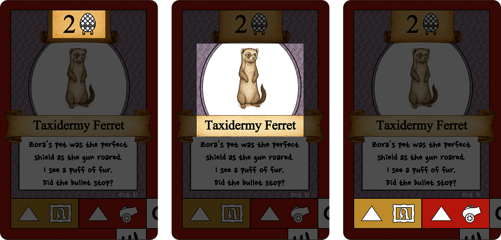
And here’s one of the “questionable heirlooms”, v1 of the item.
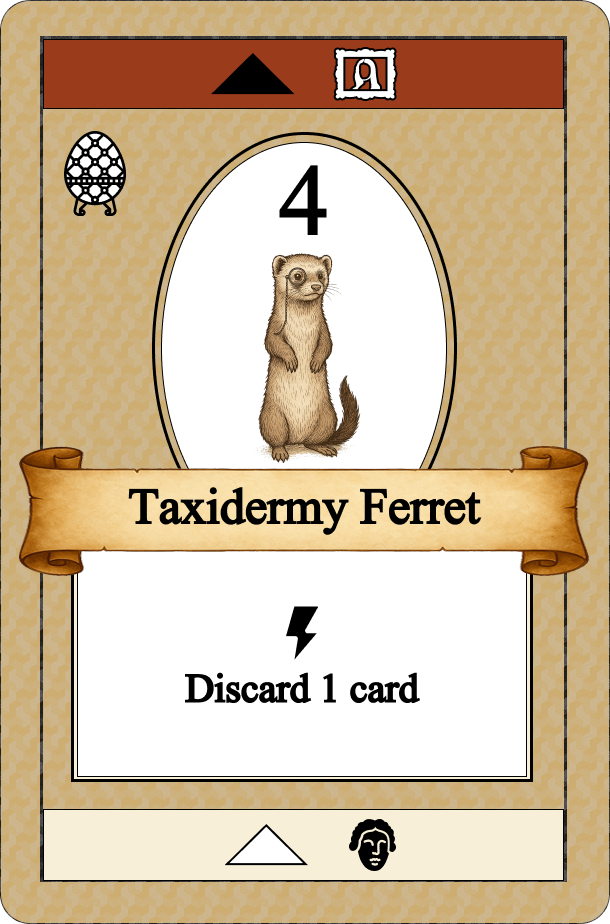
The card has 4 main areas, each trying to communicate something different:
- Left: This is the value and suit of the card (think 6 of Diamonds).
- Middle: This is the “fun” part of the card. Each card has a unique and quirky item name and picture.
- Right: When a player wins this card, the winner gets a power (good or bad).
And the 4th card feature:
That last features requires a little explanation. I love interesting mechanics. I came across this game where the back of the draw deck influenced the flipped card’s impact, so I built this into my game. It was meant to work that when the Taxidermy Ferret is drawn and placed next to the draw deck, it may be won in one of 2 possible ways:
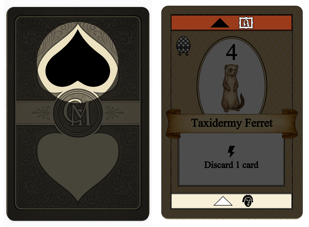
- If the card back of the draw deck has a black spade: The Taxidermy Ferret may be won with the highest Painting item (the picture icon).
- If the card back of the draw deck has a white spade: The Taxidermy Ferret may be won with the highest Sculpture item (the face icon).
That’s a lot of heavy lifting for one card. And a lot of things that are relevant based on where the card lives (in your hand vs on the table).
I had many playtests, spoke to many people. Here’s a snippet of feedback that I heard:
- “My favourite part of the game is the story and all the quirky items!“
- “I want more control over how a card on the table is won”
- “The cards are very ‘busy’”
- “I don’t love the ‘black vs white’ language”
- “The cards are too confusing, and the game is not complex enough for me”
UX Translation:
- I needed to reduce the cognitive load of the cards.
- I should consider designing separate UIs for some of these features.
- I needed to leverage the Design Process Model to understand, iterate and address the feedback.
One painful adjustment is that I needed to “kill my first darling”: The back of the deck influences the flipped card. It wasn’t working. I decided to introduce a mechanism where players would vote using their cards instead of relying on the back of the deck.
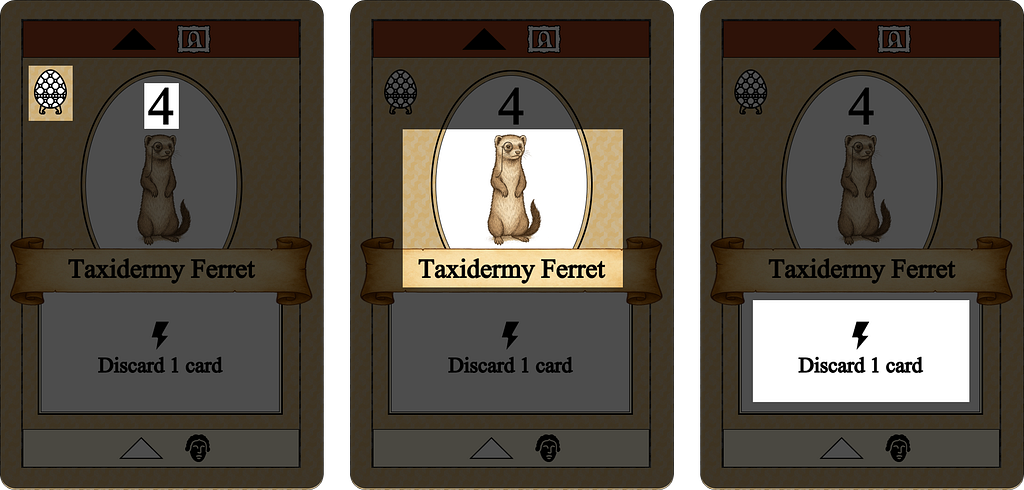
Let’s look at v2, the next major iteration:
I made a mistake. I tried to make one card do the work of four, or more. It had a suit and value, a power, two win conditions, and now even more… I had failed to prioritize the user’s primary goal. Just because I could do more in the card, doesn’t mean I should!
This version of the card has 5 main areas, each trying to communicate something different:
- Left: Same as v1. This is the value and suit of the card.
- Middle: Same as v1. This is the “fun” part of the card.
- Right: Same as v1 (Feature #4), but now combined at the bottom of the card, and changed to Gold vs Red.
Note: The “power” (Feature #3 from v1) was moved to separate tokens, simplifying the card design. But I also took the opportunity to add more of what players were asking for, story…
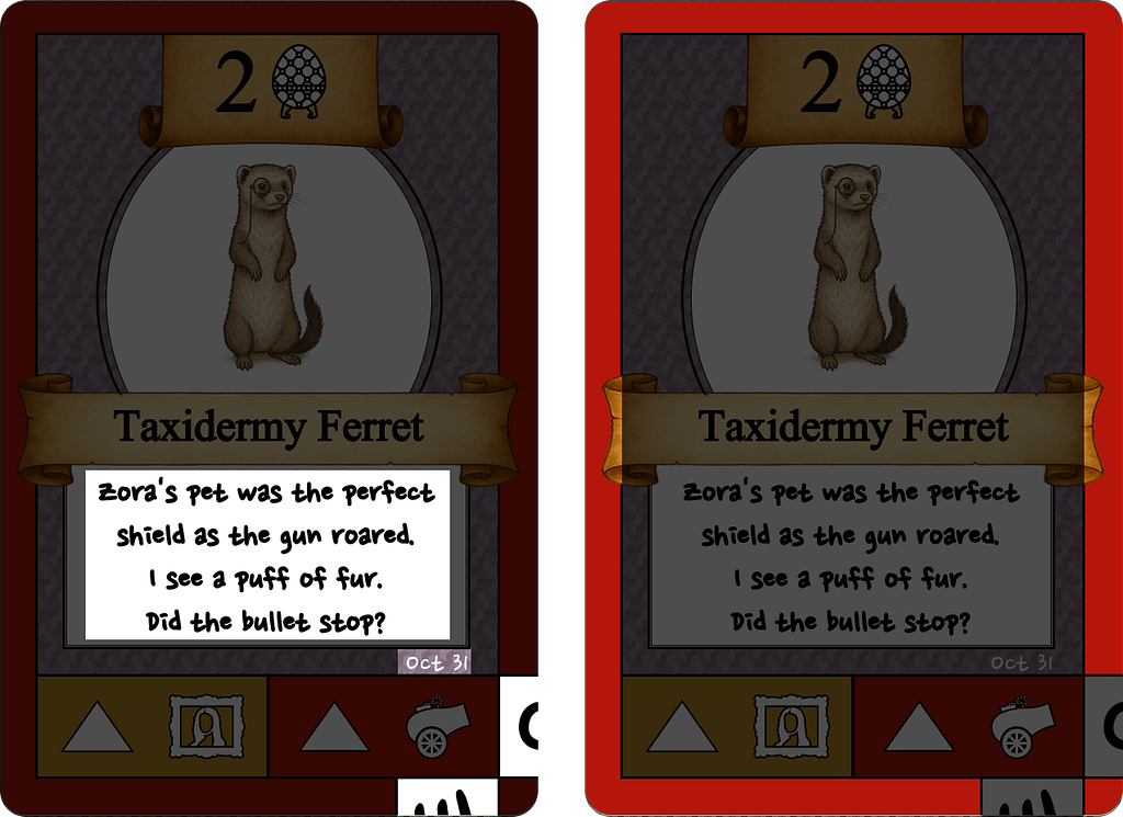
4. Puzzle: I turned every card into a piece of a meta game. It was now part murder mystery, part escape game, and I loved the “progress”.
5. Voting: Players could now vote Red or Gold to decide the win condition of a card on the table.
I thought the cards were now amazing. They gave players the ability to vote on win condition. The value and suit were together and easier to see. The win conditions were together at the bottom and colour-matched the voting. AND there was a super cool escape room murder mystery.
I thought I had addressed all of the feedback and focused on more of what people wanted, more story, less card confusion, more game complexity, no “black/white” battle… but I ignored the most critical feedback, the cards are too busy.
Now I was hearing feedback like:
- “I find the cards confusing.”
- “There’s a lot on the cards that doesn’t matter right now.”
- “So you can only solve the mystery once?” (Uhhh yes, it’s an escape room!)
- “The tokens (formerly ‘powers’) are so much fun!”
I took a step back to think about what the game was trying to be. Was the game a way for me to make people think I was smart, or was it trying to make players “feel” like they were bickering greedy relatives at a Will reading (and having fun doing so). Obviously I was aiming for the latter.
I also decided to take a moment and consider who this game was for: Casual and hobby gamers looking for a palate cleanser between rounds of Wingspan, or Ark Nova. As such, it needed to be less complex, and more focused on the “fun” part. I needed to take another look at the cards, trying to focus more on what the players I was targetting wanted, and MUCH less of what they didn’t want.
UX Translation:
- I needed to define my Personas and get into their mindset, and only build for them.
- I needed more usability testing.
- I needed to ensure my content hierarchy matched my user’s goals and the context in which they were using my cards.
- My SMEs had influenced too much feature creep.
- I needed to reduce cognitive load of the cards. For real this time.
- I needed to consider designing even more separate UIs for some of these features.
Also worth noting, I decided that I needed to “kill my second darling”. The murder mystery escape game. I loved it. But it was too much, and more importantly, it was not for my target audience. Maybe I’ll use it in a future game.
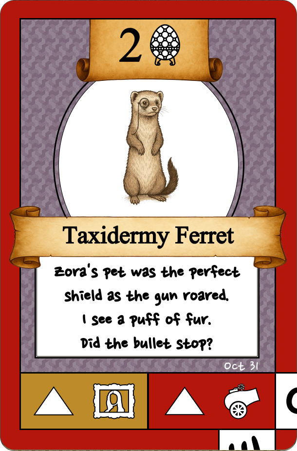
Here’s v3.
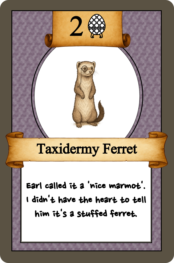
This version of the card has 2 main areas:
- Name and value: Same as v1&2. This is the value and suit of the card.
- Story: Same as v1&2. This is the “fun” part of the card. Now with even more ‘fun’ jokes.
I bet you’re wondering… where did everything else go?
- Powers: These were moved to tokens in v2.
- Escape game/Murder mystery: This was removed entirely.
- Voting: This was removed entirely, similar to v1.
- Win condition: This was moved to a new card type, introducing the Treasure card:
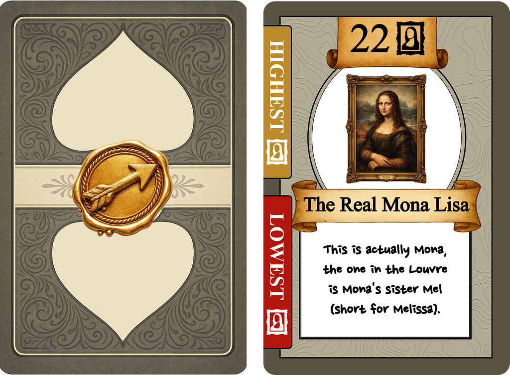
Each round a (newly designed) Treasure card is flipped, and the top of the draw deck indicates if the highest or lowest card played will win the Treasure.
When I finally simplified the cards I was able to find space for my first darling (hello old friend). And even better, it totally “fit” into the game and worked as I had originally envisioned. I was very happy.
This also gave me the ability to add more story into the game (what people wanted), introduced Treasures that the players could chase, and allowed me to overhaul the rules of the game to make it feel more like a greedy Will reading, complete with an embezzling Executor! Everything just clicked and the game felt much more fun & engaging, felt like a bunch of greedy relatives bickering, and most importantly, was far less confusing.
Overall, taking a minimalist design approach to the card (instead of trying to have one card to more work than it should) made the card easier to understand, added more space for thematic fun, and improved the game overall.
I need to do even more playtesting, but based on the feedback I’ve already heard from this newest version, I believe the cards (at least) are “ready”. Over this journey the most critical takeaways were:
- You must clearly identify who your game is for and build for them.
- Your game will only improve if you remain open to feedback (even if it means shelving something you really like – it can always come back, in this game or the next one)
- Stay focused on your vision – just because ideas are shared, doesn’t mean implementing them will make your game better. It’s your game, you decide.
If you are curious to what attending the Will reading and is like, the game draws inspirations from I’m the boss, For Sale, and High Society.
As you can see, board game design and UX go hand in hand. Designing for your audience is like Persona creation. Playtesting is like usability testing. The playtesting mindset is the Design Process Model, expanding and contracting as you identify and work to resolve negative feedback. Having a deep background in User Experience has helped greatly, and sped up my game design process. It’s been 2 months since Great Uncle Mort is Dead was born, and I think I’m ready to start pitching it to publishers. I would not be here today without both my obsession with board games, and my passion for User Experience.
If you’ve made it this far and would like to talk about board game design, or user experience, let’s connect.
All cards were designed by me and include iconography from NounProject, whereas the illustrations of the Taxidermy Ferret, Mort, the scrolls, and “Mona Lisa” were AI generated as placeholders. If and when this game is published they will likely be replaced, by the publisher.
UX in board game design was originally published in UX Collective on Medium, where people are continuing the conversation by highlighting and responding to this story.