
Summary:
Information tips can clarify complex UIs, but they should not hide essential information, trigger redundant information, or disrupt the current workflow.
Information tips — those helpful little messages triggered by tapping or hovering over a question mark (?) or info (i) icon — can help users make faster decisions and increase the understandability of UI elements. But in practice, they’re often overused, misapplied, or bloated with unnecessary content. When info tips hide essential instructions or bury users in redundant explanations, they create confusion rather than clarity.
What Is an Info Tip?
An information (info) tip is a brief, contextual message designed to offer supplemental information about a specific interface element or step in a workflow.
It’s typically activated by hovering over or clicking on a small icon — often a lowercase i or a question mark — and is attached to a specific element within the interface (e.g., a text field, icon, button, label).
Info tips can be revealed through two primary patterns:
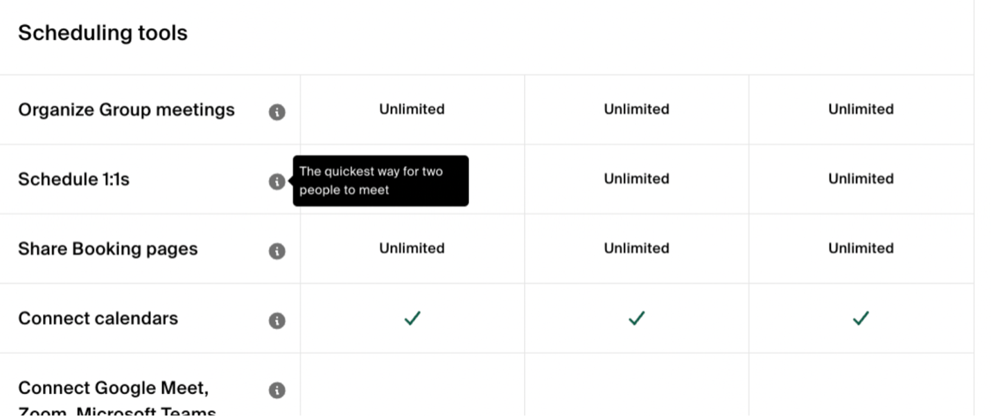
- Tooltips, which appear on mouse- or keyboard-hover gestures within desktop sites
- Popup tips, which are similar to tooltips, but are triggered by clicking or tapping an element’s associated icon
Both types serve the same core purpose: providing extra context to those who need additional clarification or guidance without overwhelming the interface with text.
Representing Info Tips in User Interfaces
The i Icon: General Information
The encircled lowercase i icon is broadly understood to indicate optional, helpful information.
In our icon-related research, participants interpreted the i icon primarily as representing an option for “more information” and expected it to reveal supplemental information such as:
- Definitions
- Additional details or brief explanations
- Promotional terms
This makes the i icon a good fit for general information or nice-to-know guidance, but not urgent or error-related content. It is a solid choice for representing info tips that support user understanding without interrupting flow.
The ? Icon: Help and Support
The encircled question-mark icon (?) is also used frequently to trigger info tips. In our research, it was more strongly associated with help and support than with general supplemental information.
People expected this icon to lead to:
- FAQs
- Customer-support contact information
- Help content or tutorials
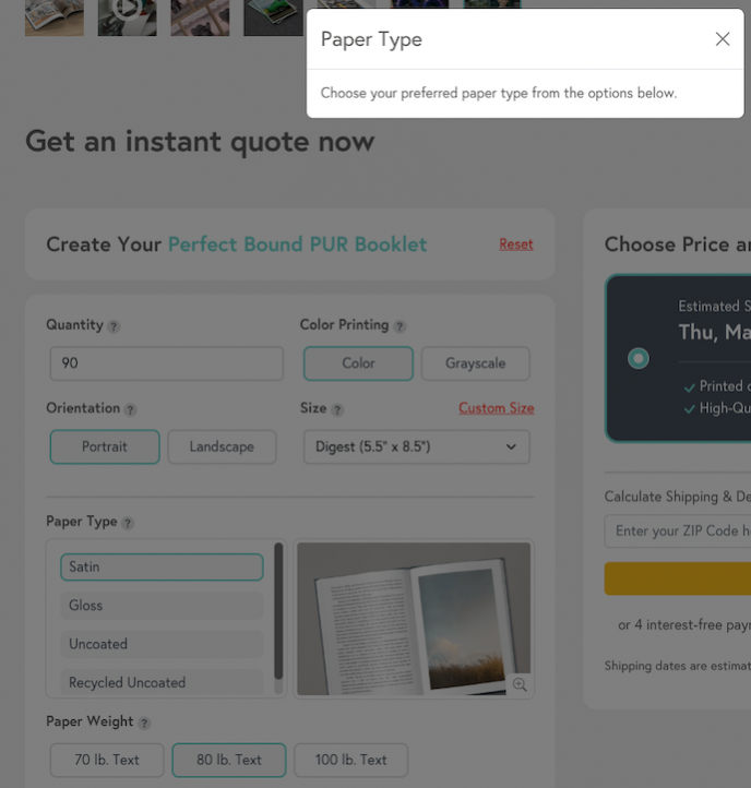
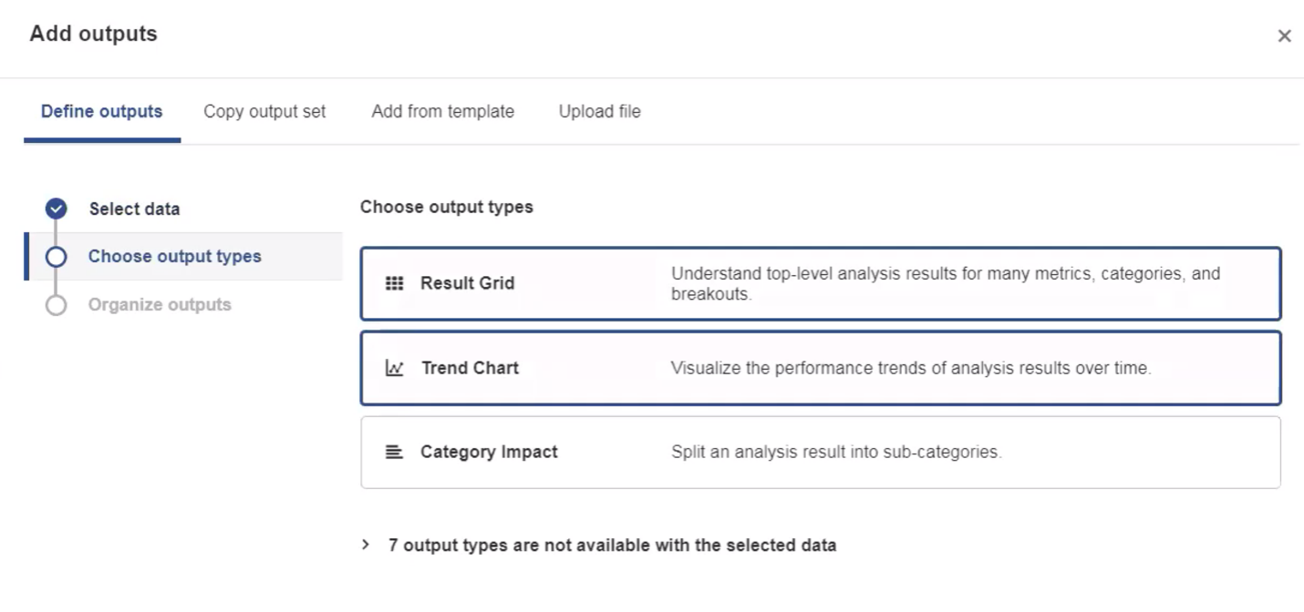
However, when placed directly next to a specific interface element (such as the form field label in the example above) the ? icon is also an effective trigger for contextual help about a specific element. The key is proximity: When the icon is close to what it refers to, users interpret the help as local and relevant, rather than global or generic.
The Problem with Info Tips
Unfortunately, info tips are often abused as band aids in the interface, used to:
- Cram in explanations that should’ve been designed into the UI
- Hide critical instructions in the name of a “clean” interface
- Offload poor labeling or UX copywriting onto the user
Info tips are not a catch-all solution for decluttering the interface by sweeping essential content into a hidden layer. Nor should they be used to bury large amounts of information that disrupt users’ flow when revealed — what we call the “jump scare” scenario, where a user expects a quick tip but gets an entire modal or screen takeover instead.
But info tips aren’t inherently bad. When well-implemented, they offer concise, helpful, and contextual information that improves usability without cluttering the interface.
Well-crafted info tips can:
- Clarify jargon or technical terms
- Explain why specific data is requested
- Guide users to locate needed information
- Reassure users about data usage
However, a good rule of thumb is to assume that most users will never see the info tip. Those who do have extra motivation for seeking them out are confused, stuck, or need clarification or reassurance. That’s why info tips should deliver clear, in-the-moment guidance that directly supports the user’s immediate task.
Pitfalls of Bad Info Tips
Info-tip misuse generally falls into three categories:
- Wasting users’ time: Displaying obvious, redundant, or irrelevant information
- Hiding critical information: Burying essential guidance or constraints most users will need upfront
- Interrupting the task flow: Using intrusive patterns such as modals or overlays that take users away from the task at hand
Pitfall #1: Wasting Users’ Time
Every info-tip interaction — even just that one small click or hover — incurs a small but real interaction cost. Redundant or obvious tips waste users’ time and undermine trust.
Don’t use info tips for:
- Marketing fluff
- Restating visible content or instructions
- Reexplaining the obvious
Info-tip icons like the i or ? signal to users that something might be unclear or needs elaboration. When they instead reveal generic marketing fluff, users can feel misled and frustrated.
Info tips also waste time when they restate what’s already perfectly clear in the interface. These tips give the illusion that additional explanation exists, but deliver only repetition.
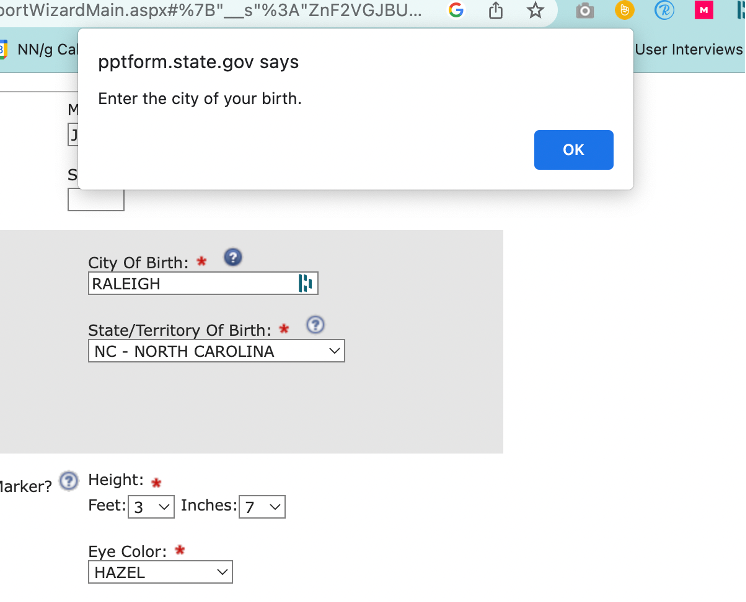
Pitfall #2: Hiding Critical, Task-Assistive Information
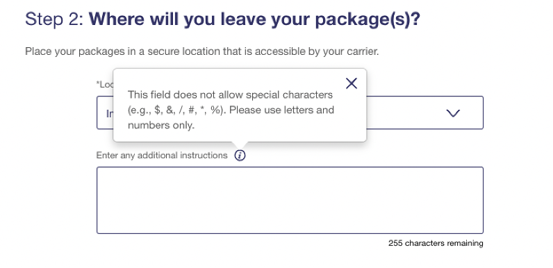
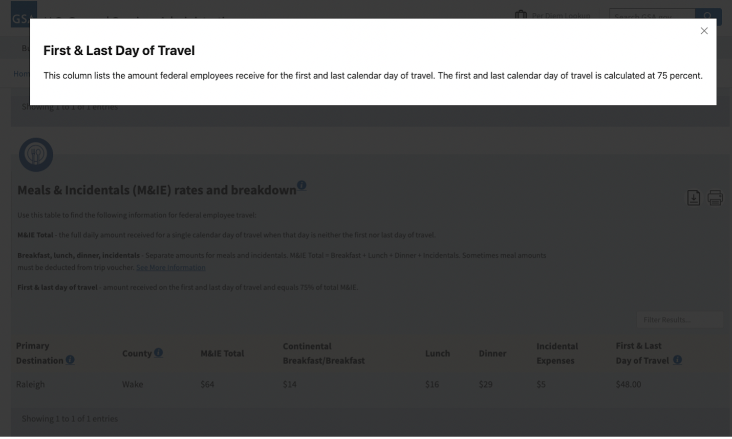
Info tips should not be used to bury essential instructions, constraints, or legal disclaimers. Doing so turns important guidance into a game of hide-and-seek and could even be a deceptive pattern in some cases.
Avoid putting in info tips:
- Constraints or rules
- Form-field limitations (e.g., character limits)
- Legal agreements or disclaimers
- Complex instructions or explanations
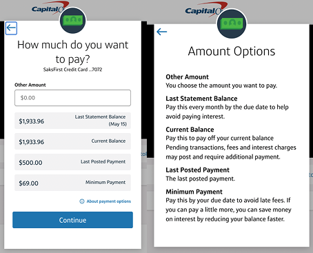
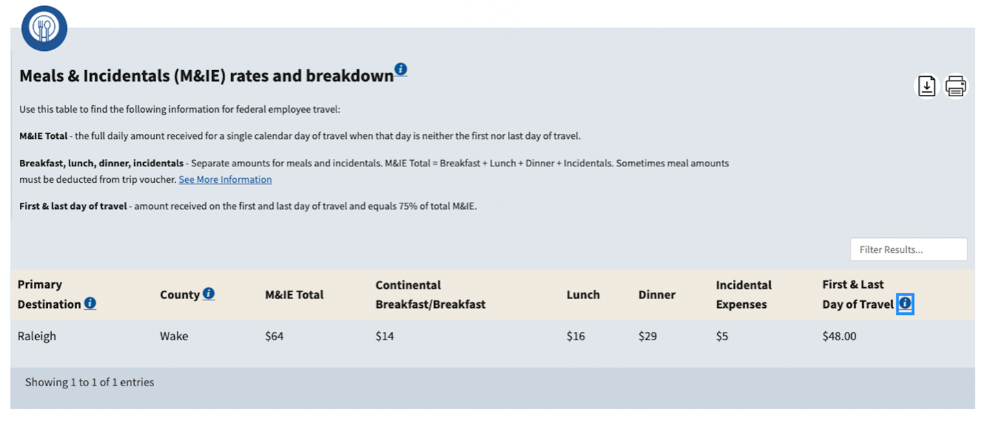
Complex instructions that help users make decisions should be visible, not hidden in a tip. People need to reference these explanations while completing tasks, not break their flow or current view to search for guidance.
Instead of hiding complex instructions in an info tip, it’s more effective to display key information at the primary level of the interface. When users must weigh multiple options or make nuanced choices, surfacing that guidance upfront enables quick comparison without disrupting task flow.
Additionally, any constraints, rules, or limitations for inputs should be displayed on the primary level.
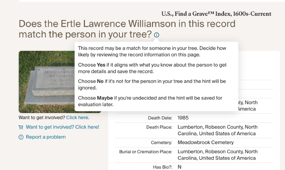
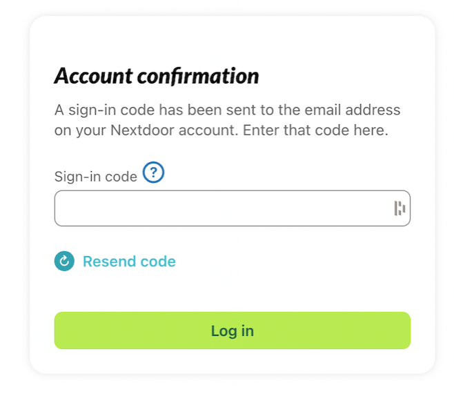
Pitfall #3: Interrupting the Task Flow
People expect clicking an information icon to reveal brief, helpful messages that they can reference in the context of their current workflow — not modal windows or full-page takeovers of walls of text.
Don’t surprise users with:
- Overly complex, verbose content
- Modals or overlays that block their task
- New pages that take them away from the workflow
When possible, ensure that info tips are displayed inline or adjacent to the relevant element. Obscuring the current step or view of the interface makes it harder for users to connect the guidance with the task at hand.
Modals and full-page overlays are jarring when used for info tips. Keeping the guidance adjacent to the element it supports allows users to maintain context and better understand the relevance of the information.
Even more disruptive is launching an entirely new page from what appears to be a simple info-tip icon. This approach not only obscures the context but also forces users to abandon their task.
Conclusion: Use Info Tips Wisely
Info tips can enhance clarity when they offer just-in-time, supplemental guidance within the context of the current workflow.
Do:
- Use info tips for supplemental content
- Keep them short, contextual, and easy to dismiss
- Represent them with familiar icons (i or ?)
- Assume users who activate them need quick, in-the-moment guidance
Don’t:
- Hide essential or frequently needed information
- Use info tips as a crutch for poor labeling or dense layouts
- Trigger popups or overlays that hijack the user’s focus or flow
When thoughtfully implemented, info tips reduce confusion and increase user confidence. But they should always serve the user’s goals, not the designer’s desire to declutter at all costs.